Sunday, 25 April 2010

Final Magazine

Evaluation Presentation - Final Without Animation


Evaluation Presentation W/ Information


Above is my evaluation presentation which analyses and evaluates the different elements of my music magazine and the reasons behind my decisions.
I thought that it went well as I addressed each question and I developed my ideas to back up each question and my points. I feel that I could have added evidence from existing music magazines to show the different conventions used and developed but to also give evidence to demonstrate the similarities and differences between my music magazine and existing magazines.

My Reader Profile

•Genre: Pop Rock
•Age group: 15-23
•Gender: unisex but mainly female dominated
•90% are in full time education
•70% enjoy listening to music via iTunes
•On average 90% purchase 0-5 albums per month
•50% purchase their albums online whereas 40% purchase albums through music stores
•50% enter competitions for prizes e.g. iPods
•50% attend concerts on a regular basis
•70% use blogs and social networking sites
•60% purchase music magazines regularly
•70% research into upcoming artists based around their preferred music genre

Above is my reader profile for my magazine. To create my reader profile I used my questionnaire, NME reader profile analysis and my mood board. I used the information collected to help me create my reader profile which I would then use to create my magazine according to what my target market would enjoy to read and what to include in the magazine. My questionnaire was mainly targeted at my market to help me create a reader profile suited to my audience.

Monday, 19 April 2010

Constructing Interview - Conventions

The main conventions used in my interview are:
  • Stand first
  • Pull quotes
  • Caption
  • Image
  • Page number
  • Website link
I added a stand first on my interview page as it gave a summary of what the interview included and also allowed the reader to feel as though they are up close with the artist. The pull quotes are scattered around the page to give a sense of energy. The caption explains the image and the interview. The image on this page isn't as dominant as the others due to its placement. I chose to place it on the floor as it gives a relaxed feel to the interview and it also holds the interview together as my artists foot is holding the pull quote in place. The page numbers help the reader find the page they are looking for. I have challenged a convention by adding in a link to my artists website, this would allow the fans to keep up-to-date with my artist.

Constructing Contents Page - Conventions

The main conventions used in my contents page are:
  • Columns
  • Teasers
  • Page numbers
  • Central image
  • House style
  • Free CD
When creating my contents page I chose to include columns as it makes it easier for the reader to read and makes the layout of the page look neater. Teasers would attract my reader and having the page numbers next to it would make it easy for the reader to look at a certain page. Again I used the central image as it is dominant and attractive and the house style runs through my magazine so connect each page. A convention which I have challenged was adding a free CD to my magazine as it is not very common in most magazine, also I added in a paragraph explaining the meaning of the album and background history on my band.

Constructing Front Cover - Conventions

The main conventions on my front cover are:
  • Masthead
  • Barcode
  • Issue no.
  • Central image
  • Banner
  • House style
  • Price
  • Quotes taken from within the magazine and articles featured
These conventions have been used developed from other magazines. The masthead is bold and dominant which is common in most magazine. The barcode is featured on the front cover alongside the issue number. The central image is bold and dominant which attracts the readers attention. The banner is bold and the main colours of purple, yellow, black and grey are bold and distinguishable. The price isn't very expensive as my audience are mainly in full time education and therefore cannot afford expensive magazines. Finally the quotes help the reader understand what type of magazine it is and what would be featured in it, it would also attract the reader as the interviews featured are based around the genre of the magazine.

Development of Images

This is the process which i had to go through to create my contents page image:
I began by taking a still image of my model
I then used Picasa to turn my coloured image into a black and white image
From the coloured image I cut around my model using the polygonal lasso tool on Photoshop
I then layered the coloured image of my artist onto the black and white image
To finish I added in a lens flare to brighten the image

From my preliminary task I learnt a lot about developing images to suit my magazine and genre. This skill allowed me to take an ordinary image and edit it to make it look like something that would be related to my music genre.

Questionnaire with Results


My questionnaire consisted of a range of questions which were appropriate to my target market and useful to me when creating my reader profile. I chose questions which I thought had most relevance to my genre of music and my target market and what information I could collect from the questionnaire and incorporate into my magazine. I asked 10 people who were interested in different music genre's to answer my questionnaire as I would be able to see what people are commonly interested in and what they look for in a magazine.

House Colours


The house colours I have chosen to define my magazine are black, grey, purple and yellow. I chose these colours as they have much significance within my music genre and are bold which helps them stand out. The dominant colours are purple and yellow, although they are contrasting colours they compliment each other well and stand out from the other colours. When researching into my magazine I noticed that there were no other magazines with the same colour theme, and I thought that using those particular colours will help distinguish my magazine.

Magazine Name


This is my final name for my magazine. I chose to name it "Dynamic" as it refers to the softness or loudness of a sound or note. The word comes from the Greek word "dynamis" meaning "power" which is what my genre represents. As my genre is pop rock it consists of a range of different textured music as it is a mixture of pop and rock music which are both different genre's of music. The font that I chose is bold but very much elegant to suit my music genre, as the music is soft and catchy but has a strong meaning to it. I chose to use the colour purple for the masthead as it is commonly used within my particular genre and is quite feminine to attract my target market.

Friday, 26 March 2010

Contents Page Analysis


The main point of this task was to analyse a magazine's contents page. I looked at the conventions used in detail to provide me with information to help when constructing my own contents page. I annotated the contents pages for two different magazines to get an understanding of what conventions are used when creating a magazine's contents page, and how I could apply it to my magazine and target my market.

NME Reader Profile

The image above is a copy of an annotated version on NME's reader profile. This task was created to provide us with an understanding on what information to include on our own reader profiles for our magazines. This reader profile included what the content of the magazine includes and how they target their audience effectively. I used this reader profile to help me create my own reader profile for my magazine. It also showed me what would be most effective in my magazine and how it would target my audience.

Monday, 1 March 2010

Pop Genre Picture

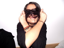
This image was taken from a simulation task in which we were asked to position ourselves for a photo which would be related to the genre in which we were given. My partner Kanwal and I were given the genre of pop, using this we had a few minutes to come up with a pose which would represent that particular genre. We decided to make ours casual and happy as those are the connotations of pop music. The leg being close to the body gives a sense of comfort and innocence which we feel represents pop music very well. The facial expression is happy which relates to the genre and pop music is connoted to be happy and fun.

Thursday, 25 February 2010

Interview Questions and Answers

My interview above is based around questions created around the genre of pop rock. I chose questions which were related to my artist and that were appropriate to my target audience. The questions were personal and based around her life, career and difficulties. The reason for me to use these forms of questions was so that the readers can understand and develop a bond with her. It could also provide them with comfort if they are experiencing any problems in their lives as she may have experienced the same problems. The language used is casual and fun which attracts readers, also the style in which she talks is to the reader rather than the interviewer which allows them to imagine that they are with her.
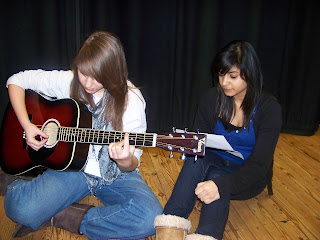
Interview Practice Pictures


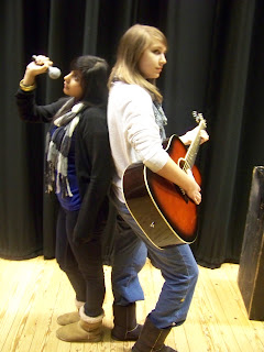
The three pictures above were taken to get a basic image of what the picture in my interview would look like. I chose to position my models as if they don't realise the pictures being taken, this makes the image seem natural which is what I am trying to portray. I used a guitar in my images to show my audience the genre of music in which I am basing my magazine on and the talent needed to be successful in that genre. The lack of eye-contact shows a sense of innocence and commitment for their music; this represents the artists in my music genre as although they are loud and fierce, they have a sense of innocence about them.

RWD Reader Profile

These two slides show some basic information about RWD's reader profile. The website contained the reader profile information but the two slides above show evidence from the magazine supporting it. As the magazine is targeted at young people aged 15-24, it bases the style of the magazine around the genre and age range.

Thursday, 18 February 2010

Rihanna Interview Analysis


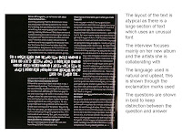
This interview was taken from an issue of RWD, it focuses on Rihanna and her new album, they also address her recent abuse by her ex-boyfriend and how that experience has helped her to create this album and move on with her life. Her new album focuses more on the genre or rock and that is shown through the style, font and colours used in the interview.


NME Front Cover

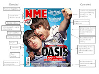
This paragraph looks at the NME front cover and the common style features and conventions used in each issue. To create this paragraph, I used the case study to help summarise the main conventions and style.

How to Run a Successful Magazine


This essay looks at the common aspects used in magazine's and tips on how they can be used when trying to create a magazine. I focus in detail on the conventions, cost, content and promotional advertising shown in the front cover and explored in detail throughout the magazine.

RWD and NME Comparison


These five slides analyse the similarities and differences of both RWD and NME. The first two images are of RWD front covers, both of which are annotated to show each element of the magazine and its representations. The next two are analysing the NME front covers and the elements used to create it. I have annotated it to mainly focus on the connotations and denotations of the covers. The final slide looks at all four slides and compares them to one another, looking at both the similarities and differences of NME and RWD.